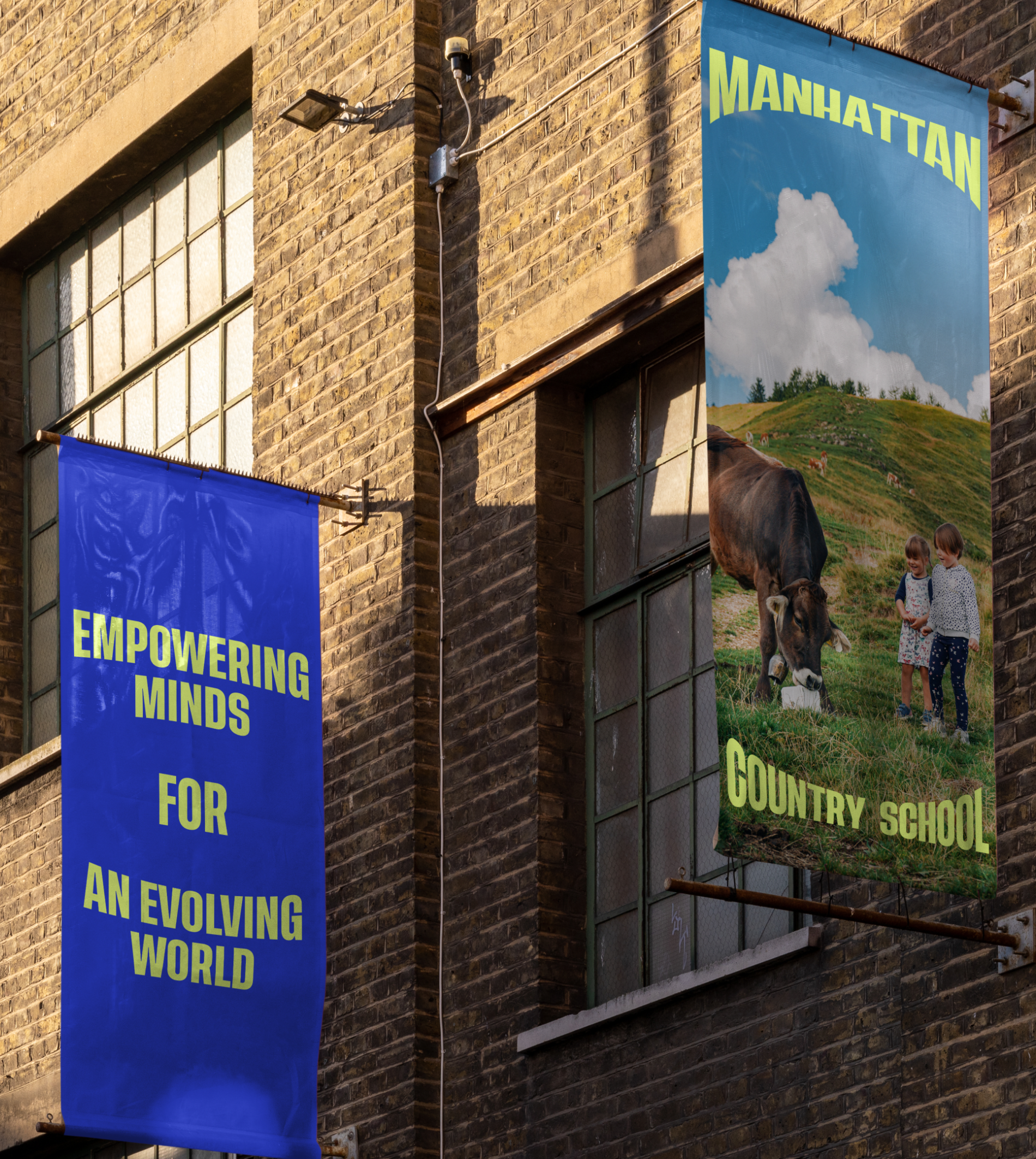
MANHATTAN COUNTRY SCHOOL
Creating a safe space for learning
The Challenge
Born out of the Civil Rights Movement, Manhattan Country School was an early pioneer of progressive education. However, their market had become increasingly saturated by schools touting DEI without true commitment. We were tasked to help them refresh their identity and articulate their distinctive voice and position in the education landscape.

The Solution
Despite the growing competition, we found that MCS had the opportunity to distinguish themselves as an authentic agent of change and leader of progressivism. We built an identity upon the insight that kids need safe spaces to feel free — free to learn, to fail, to be creative and to grow.
The primary wordmark embodies this idea literally, with the name of the school becoming a frame. Though distinctive and impactful on its own, it can also frame messages meaningful to the school, or frame images of student life and campus scenes.
The curved typographical theme extends to a variety of design frameworks beyond the wordmark, creating a cohesive and strong visual language across a variety of settings. The secondary MCS wordmark based on the oval shape provides additional impact and flexibility for use at small sizes. The energetic, dynamic typography and design system brings Manhattan Country School confidently into the 21st century.